I owe you an apology. This post has been on my “to do” list for at least two years. But like many of my “to do” list items, it got pushed back many times.
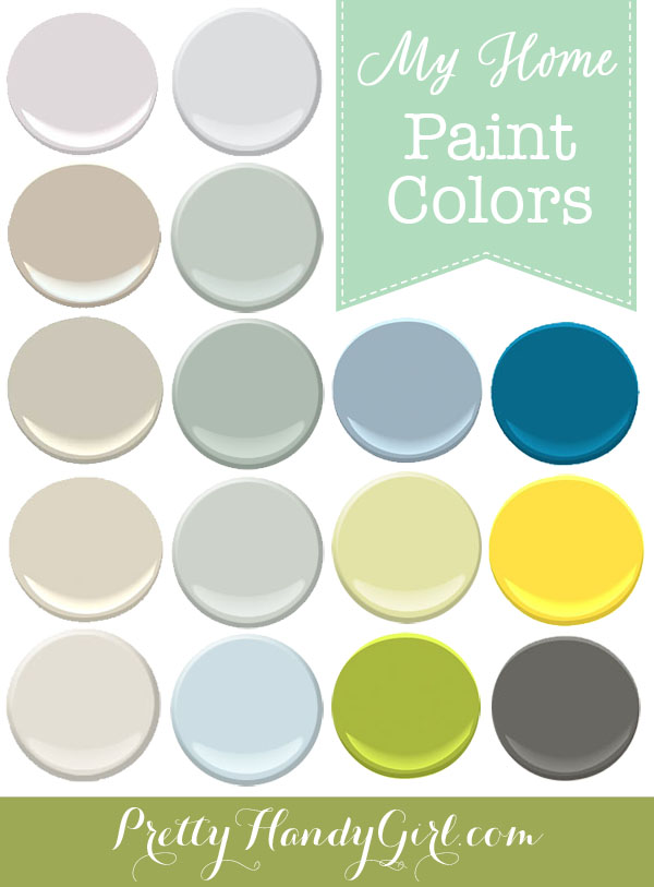
I get many questions about the paint colors I use in my home. Each color has been chosen to evoke an emotion in the specific room. At this point, I’m very happy with all the colors with one exception. I’ll explain later.
Without any more delay — you’ve waited long enough — here are the paint colors in my home!
Paint Colors in My Home
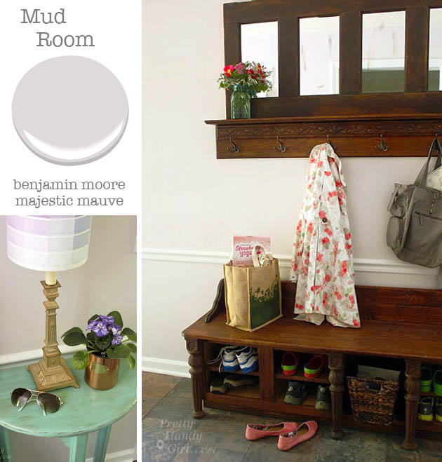
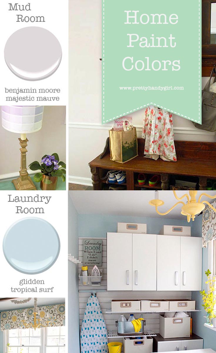
Mudroom: Benjamin Moore Majestic Mauve
This is actually a color match. I liked the color I used in our old home’s hallways so much, that I used the leftover paint in our new home’s mudroom. Unfortunately, I used up the can and forgot to write down the color. It’s the perfect neutral lavender color. The color picks up some of the purple tones in our faux slate floor.
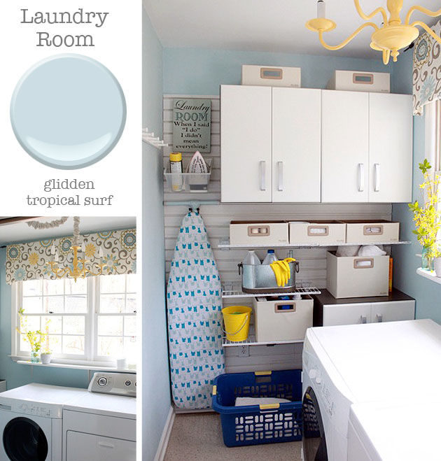
Laundry room: Glidden Tropical Surf.
I tried using Glidden paint for a sponsored post years ago. I absolutely love the color, but the paint — not so much. It just doesn’t have the coverage that Benjamin Moore Aura paints have and therefore I had to paint three coats to get good coverage and scrubability without taking off the paint. Many people ask what the valance fabric is. It’s Waverly Pom Pom Play Spa (affiliate link). And the Flow Wall organization (affiliate link) has really held up and gets my stamp of approval!
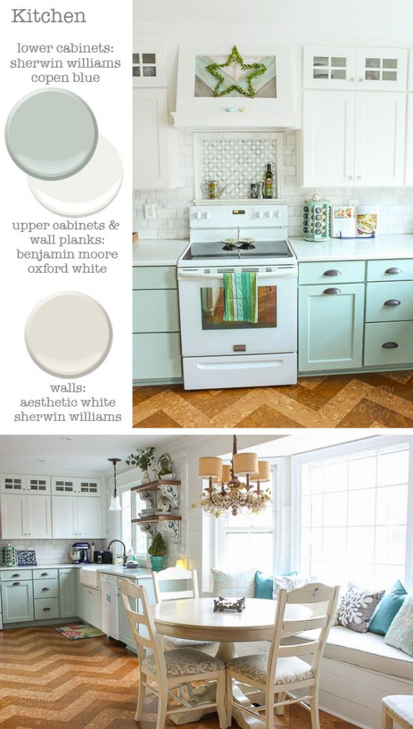
Kitchen: Sherwin Williams Copen Blue, Aesthetic White and Benjamin Moore Oxford White.
Adjacent to the mudroom is our kitchen. The colors were carefully chosen to be soothing and cheerful. The white color was pulled from the Kith Cabinets as the closest match to the white cabinets and used on all the trim and planks.
You may remember the year long saga of our kitchen. We had a leak and I built it back by myself from the subfloor on up. It was definitely a defining year in my life which has lead to some amazing goals I’ve set for myself.
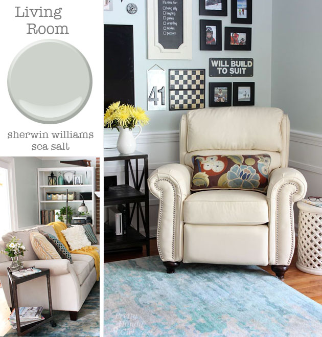
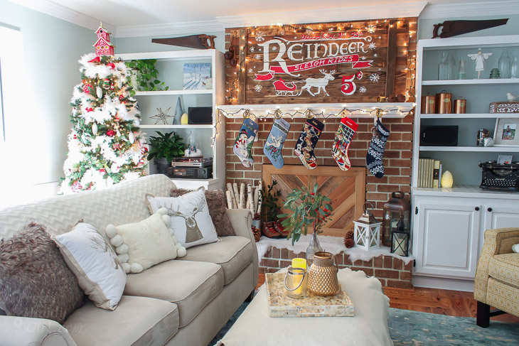
Living Room: Sherwin Williams Sea Salt.
The living room was the most recent room I painted and this is a color I’ve admired in many bloggers’ homes. The blue/green/gray color blends in perfectly with the kitchen since they share an open doorway. I get many compliments on the color and like how it changes into many hues depending on the weather and time of day.
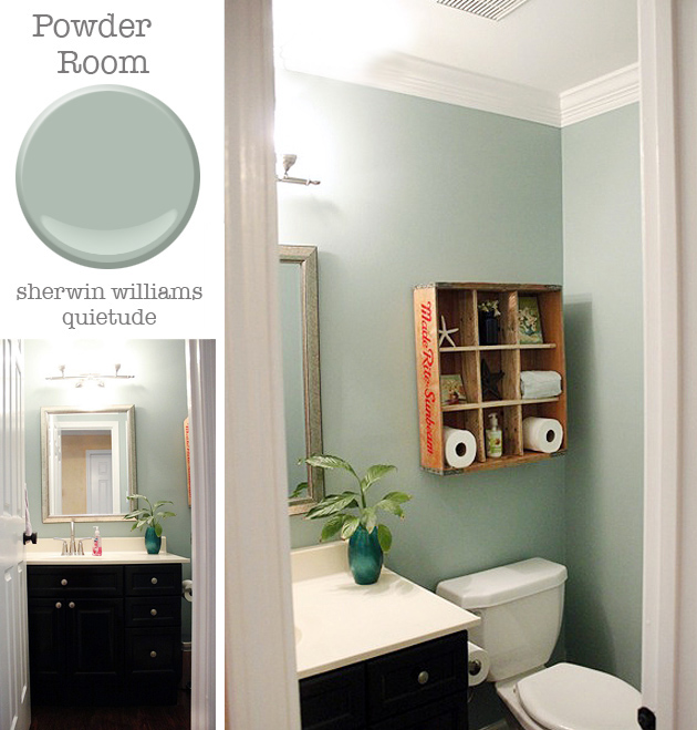
Powder Room: Sherwin Williams Quietude.
This is another color match. Oftentimes I’ll mix several leftover paints until I get the desired color. Quietude is a close match and I’ve since seen the same color in a friend’s home and it is almost an exact match.
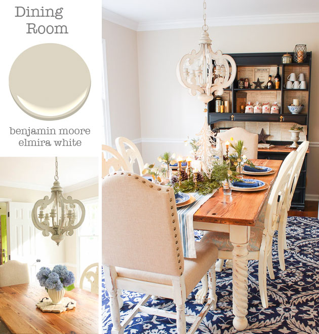
Dining Room: Benjamin Moore Elmira White.
This is the first room I painted a light off-white. Previously I thought to have a colorful home you had to have colorful walls. Over time I learned that I had more “color freedom” if the walls were a neutral color and I could change the look of a room by swapping out rugs and fabrics.
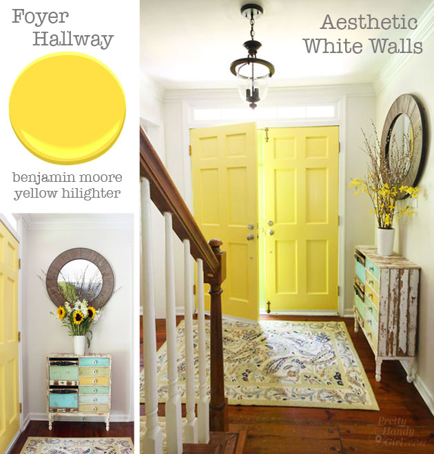
Foyer: Benjamin Moore Hilighter and Sherwin Williams Aesthetic White.
After painting our kitchen walls Aesthetic White I knew I wanted to extend it into the adjacent foyer. This color is the perfect off white but not too fleshy colored. It continues up the stairs and will eventually be painted in our upstairs hallway (another lingering “to do” list item.) The yellow doors was a last minute decision when I was struggling to paint the exterior doors. I ran into an issue with the exterior paint and had to spend 5 days stripping them. I needed some sense of accomplishment so I painted the insides before continuing on the outside. This is the color that greets me every morning and I love it’s sunny disposition.
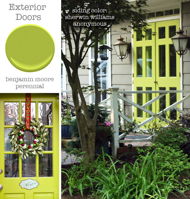
Exterior: Benjamin Moore Perennial and Sherwin Williams Anonymous.
This is the outside view of those same doors. The color was one I experimented with and had to change twice. Now it’s such a bright and welcoming color that stands out from the traditional black and red doors in the neighborhood. One of the most asked questions I get is “What is your house color?” Sadly I don’t know, but recently matched it with Sherwin Williams Anonymous. The color is a deep warm gray and it doesn’t show dirt or the mildew that plagues our southern local.
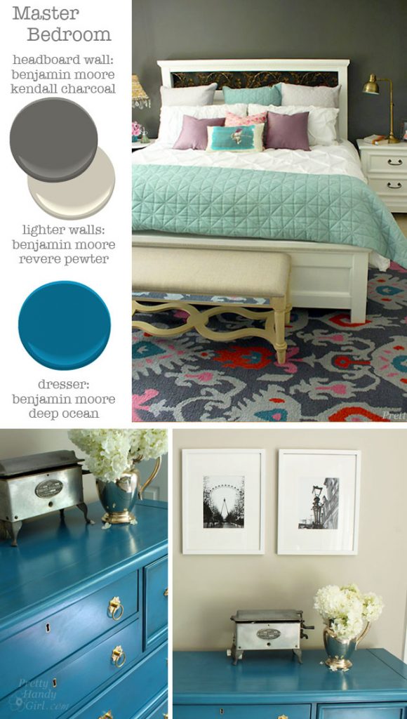
Master Bedroom: Benjamin Moore Kendall Charcoal and Revere Pewter. Dresser: Benjamin Moore Deep Ocean.
When I set out to paint our master bedroom I had fallen in love with the dramatic look of white furniture against dark gray walls. But, I couldn’t bring myself to darken an entire room with the charcoal color. My compromise was to paint the headboard wall dark, but create an ombre effect leading into a lighter greige. When we are headed to bed, we climb into bed looking at the dark charcoal. But, when we sit up in the morning it is facing the lighter walls. It’s a nice way to set the mood.
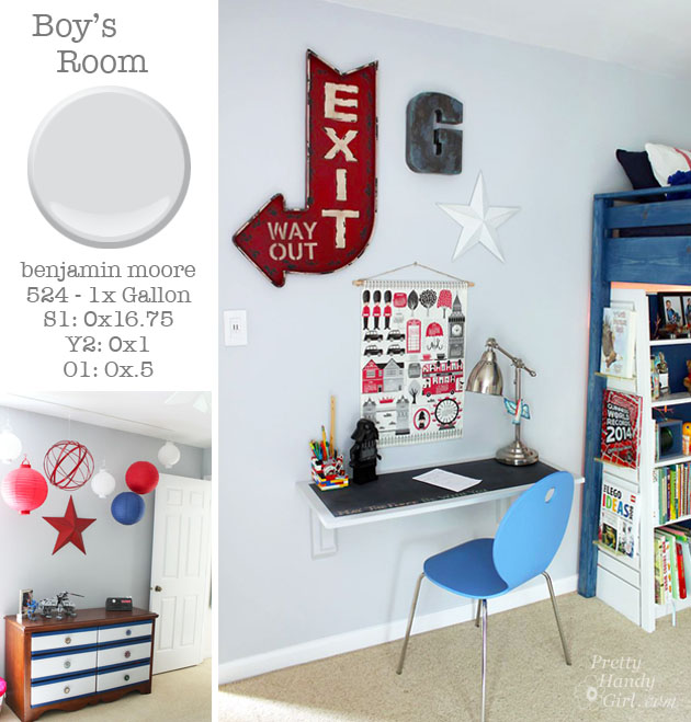
Boy’s Bedroom: Benjamin Moore custom color.
Remember how I like to mix paint colors? That’s exactly what I did to get this color. I knew what color I wanted in my mind’s eye. But, I none of the color swatches I brought home were working for me. This gray has a bluish cast, but it’s not harsh or cold. The color works perfectly with the red/white and blue theme in the bedroom.
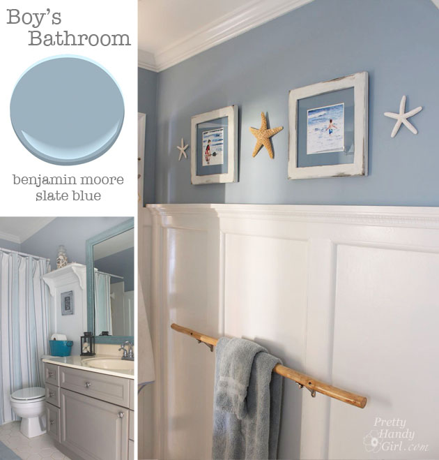
Boys’ Bathroom: Benjamin Moore Slate Blue.
I painted this room many moons ago and a color was chosen that would transition from childhood to adulthood and never need to be painted again. So far, this paint color has lived up to that goal and acts as a perfect backdrop to the gray and aqua accents in the room. Many ask and sadly I can’t remember where the shower curtain is from. It was either Ross, Marshalls or HomeGoods several years ago. The vanity received a makeover and was painted Valspar Beige Shadow (a good match to Annie Sloan French Linen.) I have a funny story about that branch towel bar. When Better Homes and Gardens came to photograph my home, the art director wanted me to paint the branch white. I flat out refused for many reasons. The main reason was that it was a memento of one of the camping trips my husband and I made to Yellowstone, Acadia, Nova Scotia or somewhere else. It’s funny that it’s a memento and I can’t remember which trip it was from. Regardless, we were young and un-married, but that branch holds many memories and has moved with us many times. I’m sure the movers thought I was nuts for packing up a branch. The other reason I wouldn’t paint it is because it would blend in with the walls. And this branch needs to stand out because it’s not “just a branch” to me.
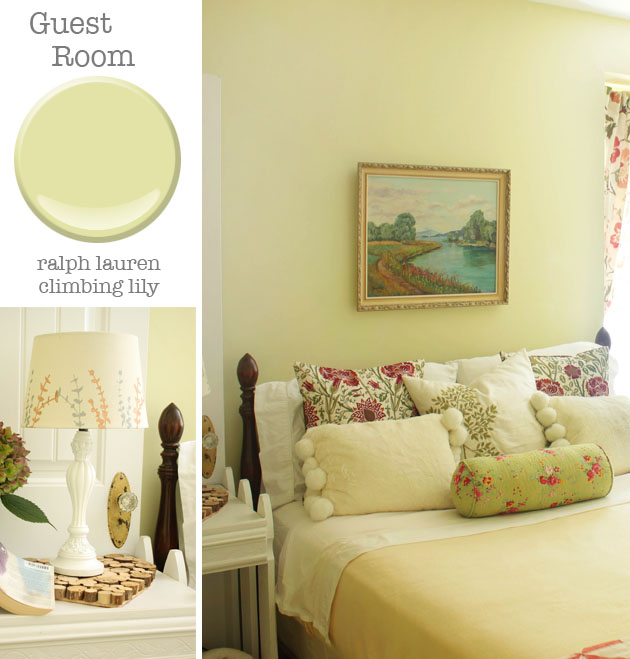
Guest Room: Ralph Lauren Climbing Lily.
This is the one room in the house that I can add feminine touches. This is my English Garden room and the light green works well with the pink flowers.
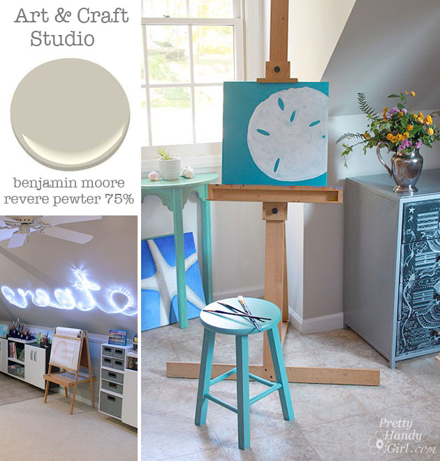
Art Studio: Benjamin Moore Revere Pewter 75% strength.
The art and craft room needs a neutral color so as not to influence the colors we use to create. I love the Revere Pewter, but wanted a light color to help bounce more light around the room. Ask your paint person to mix this color at 75% strength and you’ll agree, it’s the perfect greige that doesn’t darken the room.
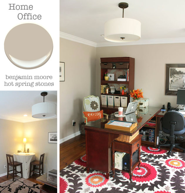
Home Office: Benjamin Moore Hot Spring Stones.
I almost left this room off because I’m not thrilled with the color. I painted this room when I began blogging. It’s a big improvement from the dark and dreary color that used to be here. But, I’m still craving more light and a color that has less warmth. At night the color turns a bit fleshy. This is the next room that will get a makeover this year. I plan on adding a much needed window to the back wall where the desks are. I’m also planning on repainting the room (not sure on the color yet. Do you have a favorite paint color?) and adding wall shelving on the same wall as the window.
Final notes:
I didn’t mention my trim colors. Most of the trim paint is the straight up white paint from the Benjamin Moore Impervo line. But, I’ve fallen in love with our white kitchen cabinet color and have been using Benjamin Moore Oxford white more.
I’m a huge fan of Benjamin Moore (especially their Aura low VOC paint.) But, this past year I’ve been using more Sherwin Williams paint (Pro-Classic and Cashmere.) And although it has a different consistency (not as thick as the Aura), I’m really liking their paint as well.
Paint colors are challenging. They can change color depending on the time of day and the season. If you live somewhere that has deciduous trees, I urge you to never pick a paint color in the winter. The green outside your window the other three seasons of the year can change the look of your paint color. Need some tips on picking the perfect paint color? Read this post.
Any other questions for me? Did I forget anything?

Pin for later!

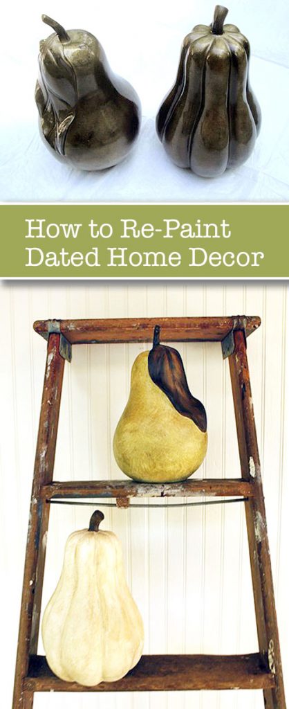 Want to know How to Repaint Dated Decor?