Hey y’all! I’m super stoked because I’m on my way to Blissdom in Nashville, TN for a few days.

I can’t wait to learn some new blogging tricks; network with a few blogging buddies; and listen to some inspiring speakers. Don’t you worry, I’ll be sharing everything I learned when I get back.

While I’m away, I will be leaving you in very capable hands. My good friend, Holly, is going to give you a tutorial for repainting and distressing a sad 1980’s chest of drawers. But, before she begins I have some news…

…I am really stoked to be partnering with Tomboy Tools, Inc. Together we’re going to bring you some serious DIY empowerment!This is such a wonderful venture for me because I love their tools; I love that their goal is to empower women; and I love that they are a company that gives back to women through the Avon Foundation.

Tomboy Tools and I are going to get YOU inspired to create more in 2012!

You may remember Holly from the Charm & Character Tour of her home. Many readers commented that they wanted to know how she distresses furniture. Holly was kind enough to create this tutorial for you:

Welcome Holly!

I’m so excited to be doing a guest post at Pretty Handy Girl! Brittany has been such a wealth of information to me as I have been working on growing my business and creating a web presence for Storywood Designs. There is truly nothing that Pretty Handy Girl can’t do and her willingness to share her knowledge and skill with the rest of us is so appreciated!

Several months back, I had a client approach me about painting an old chest of drawers she had. It had been given to her in her college years and had been painted to embrace the trends of the times. 😉 The chest itself wasn’t an antique or looked like it had been built by hand. However, it has a lot of sentimental value for my client. She wanted to pass it on to her toddler-aged daughter… and envisioned something that wasn’t too “baby” and not pink in color, and wanted to create a piece that might stay with her daughter as she grows.

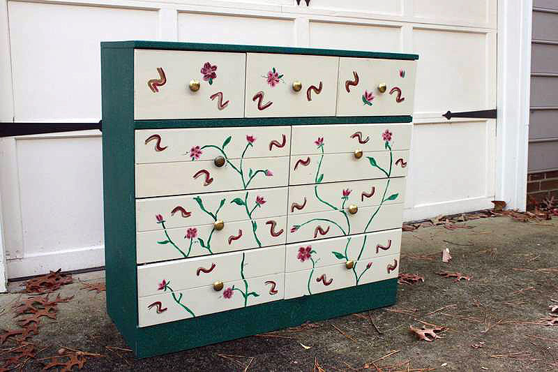
Check out the chest of drawers in all her 1990’s glory! The chest itself was painted with a textured hunter green paint and the drawers were cream with hand-painted burgundy, gold and hunter green flowers. She was in dire need of a makeover! My client envisioned a more feminine color scheme and wanted the piece to look distressed. She was also itching to get rid of the brassy hardware.

I knew there was no hope of stripping the piece to the bare wood, staining it and distressing it. The piece had always been painted and I had no clue (and neither did she!) as to what was under all that textured paint. I also knew it would be cost prohibitive to her to try to get to bare wood in order to stain. I suggested painting the piece an base color that I could use in the distressing process and to create the overall look she was going for. With a plan in place it was time to get started!

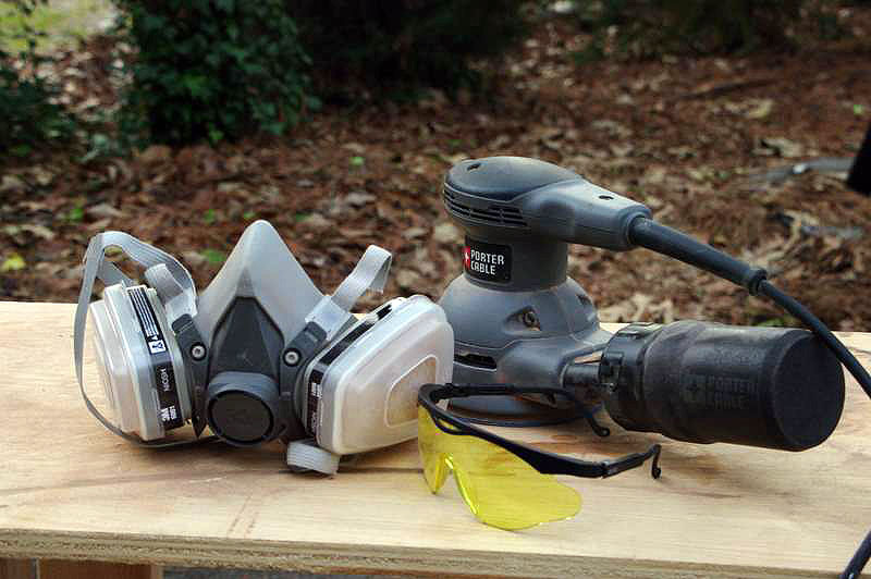
The first order of business in any refinishing project is to prep the piece for refinishing. In almost all cases, this means sanding. Painted pieces require less sanding than pieces that are being stained… and in this particular case, I knew I had to sand enough to smooth out that textured paint surface. Forunately, my orbital sander made quick work of the texture and using 150-grit sandpaper, I was able to completely remove the texture without much fuss. A mask and safety goggles are important anytime you sand – you never want to breathe in the nasty particles sanding stirs up; nor do you want to get it in your eyes. But in this case, the eye and mouth protection were super important! That textured paint flew all over the place as it was sanded off. I lightly sanded the drawer fronts as well so that the hand-painted floral design would no longer show when painted. We have a scary, apocalypse-looking mask only because we use it often and for some pretty yucky stuff, but any disposable mask will work just fine!

Once sanding was completed, I wiped the chest of drawers down well using mineral spirits. I then checked for loose pieces of the chest; keeping a close eye on drawer bottoms, corner and bottom moldings, and around the top edge of the dresser. I made repairs using wood glue and clamps to hold the pieces tightly together until dry. If needed, I added a finishing nail or 2 to the repair. Before painting, I also eyeballed the dresser looking for chips in the wood that needed to be repaired with wood putty. This dresser had a large chip in the base molding, so I filled it in with wood putty, let it dry and sanded it smooth with the orbital sander. Once the repairs were made, it was time to paint!

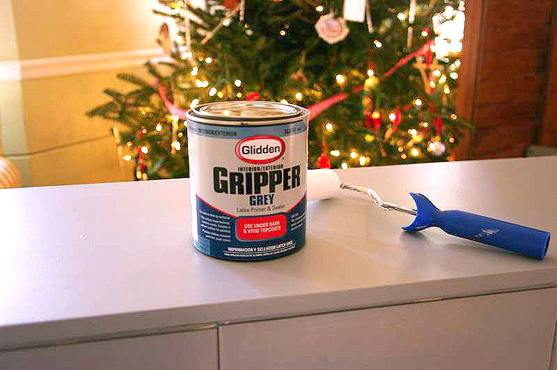
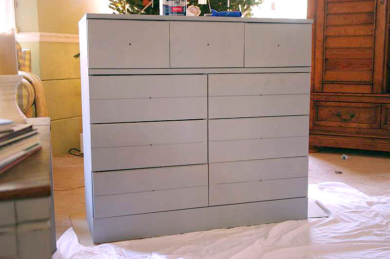
This dresser was a little different than ones I had completed in the past because my client wanted a distressed look, but we wouldn’t be distressing down to the original wood finish. I knew that the royal blue paint we were painting over needed a strong primer to cover it, so I went with Glidden’s Gripper Primer in Gray. It’s super thick, hides well and I’ve found it to have excellent coverage.

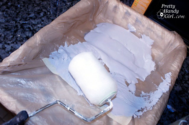
Since I didn’t have to worry about sanding through it in the distressing process, I knew it was the paint for the job. The simple lines of the dresser and its drawers made it easy to roll most of the paint on. I did run my brush through the grooves in each drawer, but was able to paint the rest of it with a roller, which really sped the process along.

Once the primer coat was on the dresser and had thoroughly dried, I went to work on the base color. This is the color we would be distressing back to instead of the original wood finish. We wanted the dresser to look like it had originally been painted an antique white color… this would be the color that peeked through the final coat when the process was complete. I went with Benjamin Moore’s Navajo White.

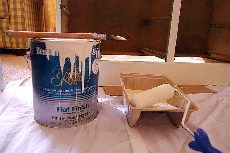
Navajo White is great because it’s one of those paint colors that is not too yellow and not too beige. It is a true neutral and has served me on many, many painting projects. I was able to apply the Navajo White in the same manner I did the primer… rolled it on with my foam roller and touched up the drawers’ grooves and various places with my brush. Since the Navajo White was only the base coat and had a strong primer underneath, one coat sufficed.

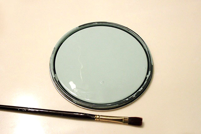
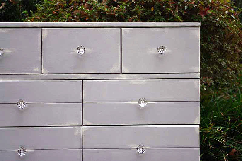
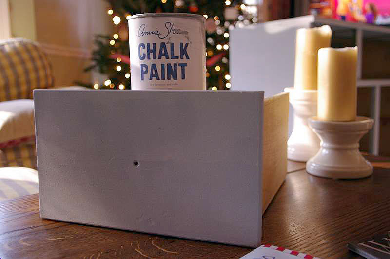
The final coat of the dresser was to be a beautiful grey color. I decided to use Annie Sloan Chalk Paint in Paris Grey for several reasons. First, Annie Sloan’s paints have great coverage and I knew that only 1 coat would be required. Secondly, and perhaps most importantly, Annie Sloan Chalk Paint gives you a lot of control in the distressing process. That control was very important to me on this project because I only wanted to distress back to my base coat, not to the primer or original royal blue color. Finally, Annie Sloan Chalk Paint waxes beautifully and easily and that was important to me as paste wax would be the final coat on the dresser. I painted most of the Paris Grey on by hand with my brush. Annie Sloan Chalk Paint is expensive and I try to use it sparingly!!

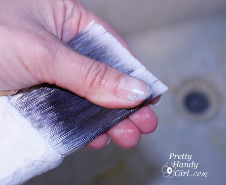
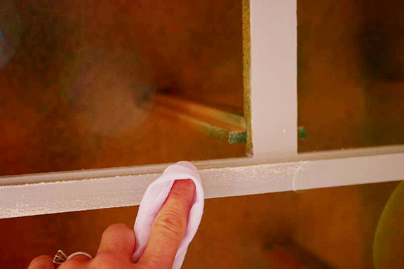
Once the chalk paint had time to dry, it was time to distress. In my opinion, this is where Annie Sloan Chalk Paint really sets itself apart from other paints. Chalk paint allows you a lot of control in the distressing process. In fact, there is no sandpaper required to distress Annie Sloan Chalk Paint! All the distressing on this dresser was done using a wet rag. I simply dampened the rag and started rubbing in the places I wanted to distress. The more I rubbed, the more distressing I got. I didn’t have to worry about sanding through my base coat and with a wet rag, I was able to get to places that would be difficult to get to with sandpaper. As an added bonus, I was able to distress the dresser in the house without a fine powdered substance all over everything!

The last steps to complete the dresser were to wax the entire piece and add the new hardware. With any piece I wax, I always start with a coat of clear wax. I’ve tried several brands, from Johnson’s Paste Wax to Briwax to Fiddes and Sons. I have yet to try Annie Sloan’s wax, only because the others are readily accessible to me in local stores. In my opinion, I have not noticed a big difference in application and finish between Johnson’s Furniture Paste Wax (which is found at Home Depot) and Briwax or Fiddes (which I can only find at a local wood working store). But there is a big difference in price. I think that it comes down to personal preference… there are definitely people that prefer one brand over the other… I just have not noticed a big difference in them! I did not apply a darker wax to this dresser… we wanted to keep it light and happy for a little girls room and I didn’t want to add the color changes that a dark wax brings to a piece of furniture.

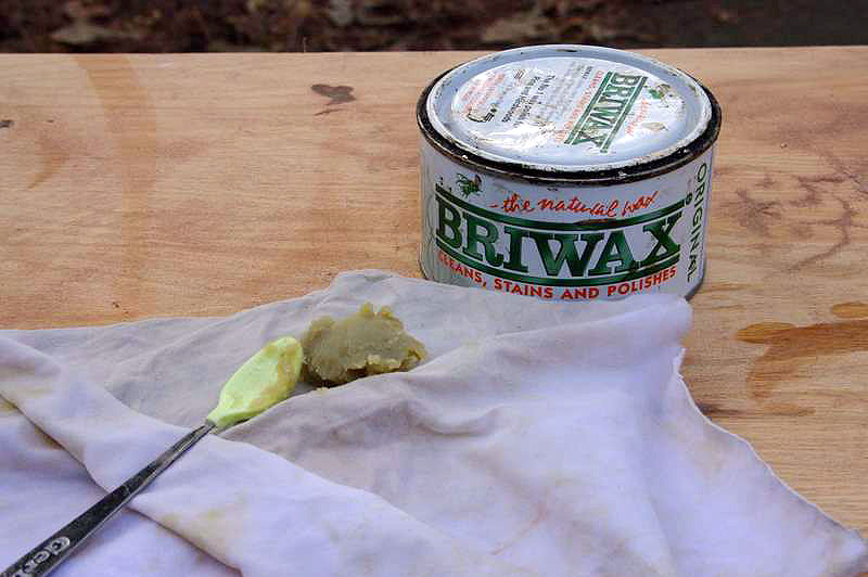
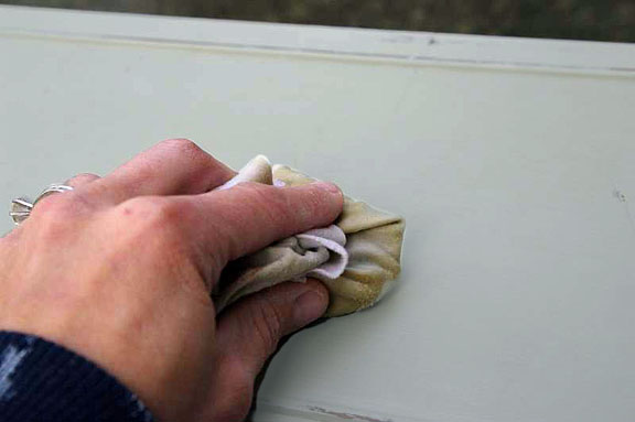
With waxing, the key is get thin, even layers of wax with each coat you put on a piece of furniture. I find the easiest way to apply the wax is to cut a clean rag, place a small amount of wax in the center and fold the rag around it. The wax will seep through the rag as you rub down your piece of furniture, keeping your coat nice and even. Once the wax coat is completely dry, you take another clean cloth and buff the piece. The result is a soft sheen and a smooth finish!

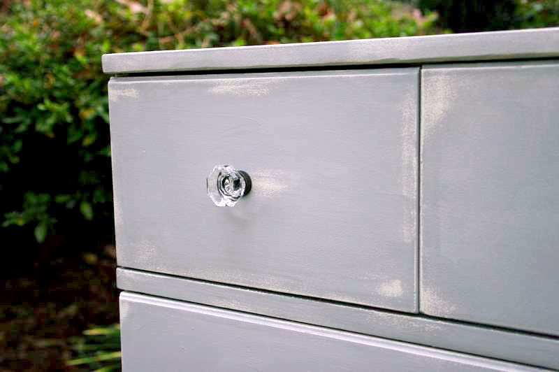
For new hardware for the dresser, we selected these beautiful glass knobs from Restoration Hardware.

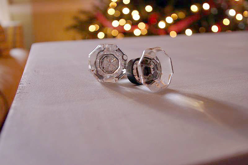
They added a bit of bling to the dresser, gave it a definite feminine touch, but weren’t too fussy or ornate. They fit into the existing holes with no issues, and with that, the dresser’s transformation was complete!

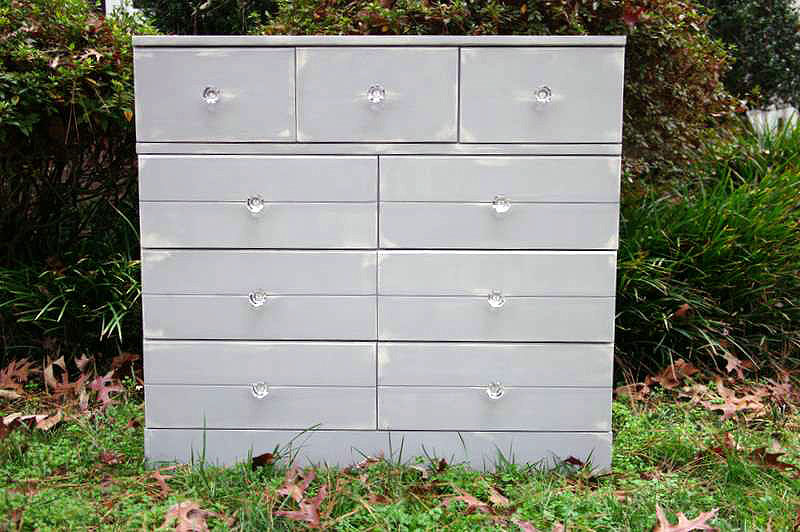
A lot of prepping and priming, several quarts of paint and a lot of elbow grease later, this dresser was transformed and updated and ready for its new life in a little girl’s room!

Thank you Holly! Oh my goodness, can you believe that transformation? From hunter green hand-painted to…

…shabby chic in Paris grey! Ahhh, that’s much better!

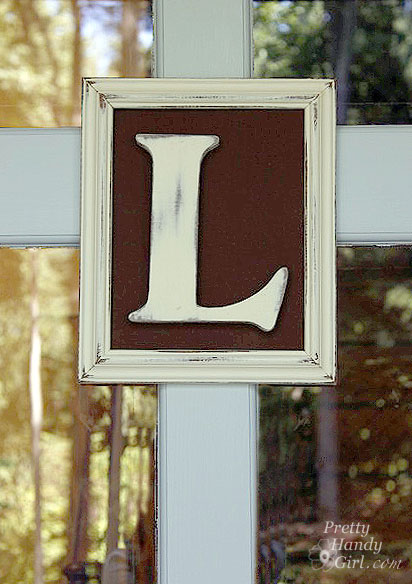
Be sure to check out Holly’s Storywood Designs Etsy shop where you can purchase a framed monogram like this one!

Holly also recently started a blog, Storywood Designs, showcasing the furniture that she refinishes. You really need to check it out!

Storywood Designs

Would you like to be a guest on Pretty Handy Girl? Well, here is your invitation: View this page for all the specifics on being my guest.


Brrrr! Anyone else experiencing the dipping temperatures? I really don’t like the cold unless it is going to snow. If it snows, I’ll put up with the sub-zero artic blast because I know we couldn’t have snow without the cold. But, if it isn’t going to snow, you can take your cold temperatures and get the heck out of here!

For this reason, I thought we needed to give Mother Nature a little hint, hint, nudge, nudge, and then a boldly displayed sign:

Cute garden flag, don’t you think?! Would you believe me if I told you that the flag is made from Dollar Tree placemats? Yup, I wouldn’t lie to you. I bought two because I wanted to decorate both sides and only one side of the placemat has a sheen to it. But, for $1 each, who can complain.

Stick around and I’ll show you how I made the flag. But, first, I have a confession to make…

…Do you secretly loathe glitter? Me, too!

When Pretty Handsome Guy sweeps up errant glitter from the kitchen floor, he’ll say, “The person who invented glitter never had children.” Then we both laugh. We were both in the camp of Glitter Haters Anonymous and detested any bedazzled art projects that came home from school. But, this week I snuck out of the camp under the radar and tried out a new product: Tulip® Fashion Glitterâ„¢ Shimmer Transfer Sheets and  Tulip® Fashion Glitterâ„¢ Shimmer Fabric Paint. Pretty Handsome Guy doesn’t know yet, but I think I’m changing my tune about glitter thanks to Tulip Shimmer products.

Why you ask? It is elementary, my dear Watson. The glitter stays put on the transfer sheets and in the fabric paint! No more sweeping up underneath the glittered project. No more random speck of glitter on the tip of my nose like a Rudolf wanna be. The shimmer products hold their glitter!

Materials:

Instructions:

Mark  a line 2″ from the top of the “flag” placemat using the chalk (this will be your stitching line for the rod pocket. Then draw your design below the pocket line.

Punch out snowflakes from the Tulip Fashion Glitter Shimmer transfer sheet. Because the sheets are thick, it is easier if you peel up the top sheet and only punch through the transfer sheet.

Cut out the rest of your design (you can leave the top sheet on if you are cutting with scissors.) After the designs are cut out, remove the top sheets.

It can be confusing to determine which pieces you removed the top sheet from, so look at the pieces from an angle and look for any reflection or shine on the top sheet of plastic.

If you pull the top sheet off too quickly, it can pull the glitter with it (see below.) Go slow, and if it does happen — don’t stress it — just cut a new one.

Position all the snowflakes and any other transfer sheet pieces on top of the flag. Pay attention to make sure the glitter side is up and the glue transfer side is down. 

Lay a clean rag on top of the pieces and iron the design onto the placemats according to the directions. (The placemats I used are polyester, so I used that setting on my iron. And it took about 30 – 40 seconds to get the transfer sheet glue to heat up enough to stick to the placemats.)

Remove the cloth and check to make sure that the design is adhered to the flag/placemat.

Before painting my snowman, I did a little test on the backside of my placemat to determine if the Tulip Fashion Glitter Shimmer fabric paint was transparent or opaque. It is transparent, so I chose the Tulip Soft fabric paint to fill in the snowman.

Paint your snowman, arms, hat, eyes and mouth using the Tulip Soft fabric paint. Using the smaller brush, paint the words too.

After the fabric paint has dried, dampen a clean cloth and gently wipe off the chalk.

Now is the time to add the Tulip Fashion Glitter Shimmer Fabric Paint magical glitter dust! I call it that because it really looks magical and the gel slowly disappears as it dries and leaves the glitter trail behind. Tinkerbell would be proud. Brush on curves and curly-q’s. You can brush on top of the words and the snowman because it will dry transparent.

Look at that beautiful magic glitter dust!

When the Tulip Fashion Glitter Shimmer Fabric Paint…ahem…I mean magical glitter dust has dried, pin your two placemats together rights sides facing out.

Stitch one line across the top. Stitch a second line across the marked pole pocket.

Leave the two sides of the pocket open and stitch down the sides and across the bottom (as shown.)

Thread the flag onto a standard sized decorative flag bracket.

And then challenge Mother Nature to “Bring it on!” (Be prepared, you might have to do a snow dance too. But that is a whole other tutorial!)

I have to tell you that the Tulip Fashion Glitter Shimmer products really surprised me. I truly loathe loose glitter, but these products really held the glitter in place. There might be a few pieces of glitter that are dislodged when you peel the transfer paper top sheet off, but honestly I didn’t notice and I never found any on me. I highly recommend these products. Especially if you have kids that love glitter!

You can find the Tulip product line at these retailers. Selections may vary per store.


Disclosure: This post has been sponsored by Tulip Products,  iLoveToCreate®, a Duncan Enterprises Company. I was sent some samples of the Tulip® Fashion Glitter™ Shimmer Transfer Sheets and Tulip® Fashion Glitter™ Shimmer Fabric Paint. I already owned the Tulip Soft Fabric paint. I was also paid a small fee in return for writing a post about my experience using the products. The ideas and opinions are strictly my own. I will never let any compensation (monetary or free product) keep me from giving you (the reader) a straight up and honest review.

Welcome back, I hope you are ready to paint with me today! If you are just stopping by and haven’t prepped your room for painting, you may want to take a moment to read Painting Like a Pro Step 1 and Step 2.

Okay, are you ready? I’m going to show you how I painted my downstairs half bathroom, the professional way!

Before

After

Materials:

  • paint tray
  • two plastic grocery bags (optional)
  • a paint roller with a regular nap for smooth walls. If you have a textured wall (orange peel, cottage cheese or as “My Boy’s Teacher” showed me: sand texture) you may need a thicker napped roller.
  • 2.5″ angled painter’s brush
  • edger (optional)
  • Painter’s tape (I prefer the Scotch Blue Delicate Surfaces tape)
  • a damp rag
  • sanding block with 200 grit or higher sand paper
  • damp sponge with a bucket of fresh water
  • x-acto blade (optional)
  • small flat artist’s brush

Go ahead and pour your paint into a paint tray (make a liner with grocery bags as I show HERE.)

Only fill the tray about half full (more than shown in the picture), you need some blank space at the top to squeeze the excess paint out of the roller by rolling it back and forth.


Painting Walls and Ceilings:

When I paint a room, I always paint the ceiling first, unless it REALLY doesn’t need painting. It is more efficient to paint the whole room while you have the tarps down and supplies out. Besides, you know you won’t go back and paint the ceiling another day. Am I right?!

You can paint the ceiling the same way I paint walls, just use an extension pole and a two-step ladder for painting the border. Don’t worry about taping off the walls or trim right now. I’ll tell you when to tape later. The only time I would use tape now, is if I need to mask off something like the vanity, a light fixture or a wall I’m not going to paint.

1. Begin by painting the border on your wall. Use either a paint brush or the edger. If you are using the Aura paint, let this border dry before you move onto the next step. If you are using another brand/type of paint, work quickly and move onto the next step.

2. Use your roller to roll out a 3 – 4 foot “W” shape. Try to roll into the edge while it is still wet (unless you are using Benjamin Moore Aura paint.)

3. Roll the roller back and forth, up and down and in random directions until you have filled in a 4′ square section of wall.

4. Roll the roller very lightly over your square to make sure the coat of paint is even; feather the edges; and to rid the wall of any start and stop roller marks.

Start on the next section with another “W” shape and repeat steps 1-4 until you have covered your wall in paint. Then move on to the next wall. Keep in mind that you will need at least two coats of paint. You’ll get a more durable paint job, more even coverage, and it will look professional if you use two coats of paint. So, own up to the fact that you will need two coats!

A few words of caution while painting:

  • If your paint has started to dry and {{gasp}} you see a spot you missed or a bug in your paint, resist the urge to roll over it. Wait until it dries, then sand or paint the messed up area.
  • It is best not to overload your roller with paint. Too much paint can drip and run. If that happens, use your damp rag to wipe it up immediately. And remember, you are going to use two coats, right?!

Now that you have completed the first coat (and it is dry to the touch), pull out the sanding block. Lightly sand all the walls. You are just knocking down any bumps (or bugs) and giving your paint layer a little “tooth” for the next coat to adhere to.

Then wipe down your walls with a damp sponge to remove all the sanding dust.

The sanding between coats may seem like overkill to you, but trust me, the sanding step makes a difference! And you wanted to know how to paint like a professional, didn’t you?!

Now, go ahead and paint your second coat of the wall color repeating Steps 1-4 above, for  painting a border and rolling the paint inside.

Done? Well, not quite. Remember when I showed you this the other day?

Yes, the wall paint is on the trim. That is okay, I want it like that. I knew I was going to paint the trim and wanted to make sure that the wall color went right up to my trim, it’s all by design baby, trust me.

At this point you have painted the ceiling and all of the walls in your room. If you are sure your walls are dry (at least 1 hour or more), then you can move on to the trim.


Painting the Trim:

Now you can go ahead and tape off the edge of your walls where they meet the moulding. Then use the matte medium  trick I showed you HERE (or you can use a small amount of wall color if you like) to seal the edge of the tape on the wall side.

Go ahead and paint all your trim with a 2 1/2″ paint brush dipped in a small bucket of trim paint. I prefer Purdy brushes because they last for years! See my post on cleaning brushes HERE to see how I protect them from wearing out.

Be sure to put two coats of paint on the trim, this will help to keep it looking new and stand up to the “Matchbox Demolition Derby” games that ensue in your home. (What? You don’t have those games in your house? Lucky for your home.)

When the paint has dried partially (don’t wait too long), go ahead and remove all the tape.

If you don’t have any imperfections, you better go play the lottery right now! If you are human and normal you will have a few. No big deal. You can use one of two techniques (I use both).

1.Gently scrape any excess paint off with an x-acto blade.

2. Use a small square artist’s brush and paint over any seepage. I like to shake my can of paint and remove the lid to expose just enough paint on the lid for touch ups.

Horray, you are done! Now you can tell your friends, “I’m sorry I can’t give you the name of my painter, because I painted the room myself!”

Here are the before and after pictures of our half bathroom. I am LOVING the results. I have a few more tutorials for you from this project. I promise, they will come in due time.

Before – Beech Wood Vanity

After- Painted Vanity Black

Before – Towel Ring on Wall

After – New Towel Hook on Wall

DIY – Vintage Soap Sign

Before – Shutter on Wall behind Door

I would love to know if you paint a room using my Painting Like a Pro tutorial. And how it worked for you!

Other Steps in this Series:

Step 1. Prep work

Step 2. paint and sheen

Painting Like a Pro

Let’s talk about Paint, Baby…

Before we start, let’s talk paint. One factor for a perfect paint job is the quality of the paint you choose. Do yourself a favor, don’t settle for the cheap store brand paint. You may save yourself a few bucks, but you will be looking at streaks and imperfections from the cheap paint for years to come. Or worse, the paint won’t hold up to wiping or moisture (not good!)

Painting Like a Pro

Painting Like a Pro

Benjamin Moore Aura Paint – Love this stuff! Serious love affair here. Not only is it low VOCs and low odor, but the coverage is amazing and you don’t see any of the roller marks. It is thick like a chocolate milk shake and spreads slightly after it is rolled on. This is the only paint I’ve been able to get away with only using one coat. But, it was because I was painting a lighter shade of sage over a pine green color. Other rooms where I was going from a much darker color to a light color, I had to use two coats, but I definitely didn’t use as much paint as I would have if I used another brand. Be prepared for the sticker shock, this paint isn’t cheap at $56 a gallon, but you will use less and you will be saving the environment!

Painting Like a Pro

Valspar – Hi Def Paint – Before we were spoiled by the Benjamin Moore Aura paint, Pretty Handsome Guy and I used to paint with Valspar paints for all our walls. In fact, we still use the Flat Ultra White for our ceilings. We were always happy with the results, but the idea of using a Low VOC paint really appealed to me.  Last week, as I eyed the “oops” paint at my local Lowe’s (a normal habit of mine), I was lucky enough to spot a color that was very close to a color I was craving for our bathroom. I grabbed it up for $5 ($10 at register with a $5 rebate. Normally $32). The paint was a gallon of the new Valspar Hi-DEF paint. I have to say, I was impressed by the coverage. It almost covered all of the old color in one coat (I was covering dark purple with a light aqua.) This paint would be a good option if you didn’t want to shell out the $56 for the Aura paint.

Painting Like a Pro

Benjamin Moore Impervo paintThis is my new favorite trim paint! This stuff goes on smooth and spreads like an oil paint. It also has a durable finish that resists chipping and really stands up to our kids’ shenanigans. Before I found the Impervo, I thought I was doomed to use an Alkyd (oil paint with a dryer added) paint for our trim. If you’ve ever had the misfortune of using oil based paint, you know that it has a strong odor and the brushes have to be cleaned with turpentine. Not at all good for you or the environment.  You can imagine my excitement (and skepticism) at finding a water based trim paint that is supposed to hold up like oil. Our living room trim paint has lasted 1.5 years and it still looks great! Again, this amazingly durable paint isn’t cheap, it costs $48  a gallon, but at least you don’t have to paint your trim every year if you have little devils boys in your home.

Please note: There are other good paints available (Sherwin Williams is also a favorite of many other DIY bloggers.) This is just a list of the paints that I love to use.


Let it Shine, Let it Shine (or maybe a little less shine) – Flat, Eggshell, Satin, Semi-Gloss, or  Gloss. How do you know which one to choose?

Gloss – The only time I use gloss or high gloss is for trim and cabinetry. (Or the things that get grubby fingers ALL over them.) The gloss surface cleans up much better than non-gloss, and it doesn’t hold onto oils or grease like the other finishes.

Semi-Gloss – This sheen is great for painting a bathroom, kitchen or walls that will see a lot of moisture, water and basic abuse.  Similar to the gloss, it will be easier to wipe clean and water splashes won’t show as much on this surface.

Satin – I know I just said you should paint kitchens and bathrooms with semi-gloss, but I rarely do. Why? Well, because my walls are far from perfect. We have two rooms that had wallpaper painted over (not my decision.) After spackling and sanding the seams (doing my best to smooth them), I used a satin paint.  Satin has most of the durability of a semi-gloss, but less sheen. If you use paint with a sheen you will see highlights wherever there is a seam, bump or edge.Therefore highlighting your imperfect walls.

Eggshell – Low sheen, but not flat. Eggshell is best for rooms with imperfect surfaces or bedrooms. Eggshell has an almost matte or flat appearance and is very smooth and hides bumps and dips fairly well. It’s not as easy to clean, but will stand up to an occasional wiping better than flat paint.

Flat – I never use flat, except….when painting ceilings. Then we grab our favorite ceiling paint: Valspar Flat Ultra White for maximum light reflection. (Read more about bright white ceilings HERE.) So, unless you are painting ceilings, don’t use flat, it is too chalky and hard to clean.

Just call me Ms. Mix-a-lot. How to Save $ by Mixing Your Own Paint:

Some of  the paints I mentioned can cost quite a pretty penny. So, I thought you might like to know the way I save money on paint. I frequently scour the “Oops” or “Mistint” paints. If I see a color that is close to what I want, I grab it. For my downstairs bathroom I spotted this sea green color and knew it was close to the color I wanted, but just a shade darker. All I needed to do was purchase an empty paint can and use some leftover white paint to mix a prefect color.

You can mix any two sheens as long as they are next to each other in the list above. In other words mixing gloss and semi-gloss is fine; semi-gloss and satin; satin and eggshell; or in my case eggshell and flat paint.  You definitely don’t want to mix a semi-gloss with a flat or eggshell. You might get some streaks and it is hard to mix.

Painting Like a Pro

To mix paint, I like to use this paint mixer attachment that fits on my drill. It is a dream come true for a custom paint mixer like myself.

Painting Like a Pro

Without going into too much color theory, here are two mixing formulas I like to use.

Keep in mind your paint color has to be fairly close to the final color you want before attempting these mixes.

Too vibrant, intense or bright – Let’s say you find a color that you like, but it is too intense and you want to dull or tone it down. You can add either black or brown paint (I use acrylic craft paint) to tone down the color. Pour some of your paint into an empty bucket or paint can, then add a big squeeze of black (or brown.) Mix it, put a dab on a piece of paper and dry it with a hair dryer (because I’m too impatient to wait.) Still too vibrant? Add more black (or brown) until it is the color you want. I used this method for my dormer hallway shutters. You’ll have to play with the mixing until you get the desired results.

Too dark, need a shade lighter – Add white paint to a bucket, then slowly add small amounts of your paint color and mix it. Put a dab on a piece of paper and dry it to check the color. Still too light? Add more color or if it is too dark, add more white.

I hope this post helps you find the perfect paint for your next paint job.

Other Steps in this Series:

Step 1. Prep work

Step 3. painting your room and finishing touches


Painting Like a Pro

Today I have the skinny on paintbrushes, they all look alike, but they don’t behave alike! Pretty Handsome Guy and I have painted our fair share of rooms, especially dated brown trim moulding. One thing we learned early on is that buying a good brush was key to making a difficult job more manageable. When we first moved in and were cheap didn’t know any better, we bought the least expensive store brand brush we could find. What a mistake! Those brushes barely held up to one room of trim. The bristles frayed and the paint brushes lost their chisel shape.
Case in point:

(That being said, the same thing can happen to a good quality paint brush if you don’t clean and care for it properly. More on that later.)

But, if you spend a little more to buy a good quality brush and take good care of it, you can use that brush for years!!!

Above you can see the cheap store brand used maybe 2-3 times.
A brush we have owned and used for 8 years!
And a brand new never used Purdy brush.
(I encourage you to click on the picture to see it enlarged!)


 Close up of the layers of paint on that 8 yr. old Purdy!

Recently Purdy contacted me and asked if I wanted to try one of their brushes  and maybe blog about it. I said sure, but I felt a little guilty. Why? (Whispering: Well, because we already have an arsenal of Purdy brushes in our painting supplies. When it comes to brushes, that is all we buy.)  Okay, this is where I need to tell you that –  yes, Purdy sent my a free brush and 5-in-1 painting tool to try out. But, did they pay me? No. And, did they ask me to write a positive review? No. So, I am being totally honest with you when I say that I do like their brushes. That being said, I have not tried some other high quality brushes. The only thing I do wish was different about Purdy brushes, is that they would develop an ergonomic handle for their brushes. After an hour of painting trim my hand always cramps up.

I haven’t bought any ergo handle type brushes, but I have seen this brush from Proform Technologies:

I might just have to try one of these next time.

Okay, so I sold you on buying a good brush, and you were shocked by the price tag. Now I want to show how to care for that brush so it will behave for you (and you won’t have to replace it anytime soon.)

Be sure to clean your brush before the paint can dry on your brush. If you can’t wash it immediately, go ahead and leave your brush in a jar of water (or mineral spirits or turpentine for oil based stains or paint).

When you are ready, here is how to properly wash your paint brush:

1. Rinse out as much paint as you possibly can.
 
2. Bend the bristles against your palm or the bottom of your sink.
Repeat on the opposite side.
3. Gently separate the brush to expose the core
and rinse any paint out of the inside of the brush.
4. Squirt some dish or hand soap in your palm.
Working in a circular motion, mix the soap in your hand with your brush
until a big lather forms.


5. Then rinse all the soap out bending the bristles if needed.
6.Repeat steps 2-5 until the water runs clear. 
7.Squeeze all the paint out of your brush using your fingers like a squeegee.
Then hang your brush upside down to dry.
I used large paper clips to make these hooks that hang over the sink.

If you are using an oil based paint you will want to substitute mineral spirits or turpentine for the soap and water. I also try to keep the brushes I use for oil paint or stains separate from my latex brushes.

Happy painting for years to come!