
Go Bold or Go Home! Show Your True Colors.
Discover 55+ colorful front doors with stunning color schemes to boost curb appeal and add personality to any home exterior.

Colorful Front Doors
I am drawn to homes that have unique front door colors and crave something beyond the normal white, black or burgundy. Give me a unique color that tells me something about its occupants!
I love being able to say, we’re the only house on the street with the coral-pink doors. In my book, you need to Go Bold or Go Home!
Get out that paintbrush and show your true colors with this gallery of Bright & Bold Colorful Front Doors.
Before we get started, a little disclaimer. I’m very good at eyeballing paint colors, but I am only human. There are so many factors that go into choosing a paint color. Time of day, time of year, weather, and your surroundings will all affect the perception of color. Throw in the mix that you’re viewing these images on your electronic device which can only make up colors using a combination of Red, Green, and Blue. For that reason, I highly recommend using one of these colors as your springboard. Get similar paint chips near the ones you like and hold them up to your front door during different times.
I go into a lot more detail about how to choose paint colors in this comprehensive article.

Front Door Paint Colors Pictures
Over the years I’ve collected quite an assortment of photos of colorful front doors.
Some are from my travels to Iceland, Scotland, England, France, and other old towns in the US. Near me in Raleigh, Cameron Park is one of my favorite neighborhoods to find inspiration. It is tucked between Oberlin & Hillsborough Street. The houses are old and the trees are ancient. But, there seems to be an ongoing competition for the boldest and brightest front doors. I used Benjamin Moore, Sherwin Williams, and Valspar color deck to choose an approximate match for each door.
If you are considering a new paint color for your door using any of these colors, be sure to paint a large sample on poster board and hold it up to your door first. Keep in mind, some of the colors may need two coats before you see the true color.
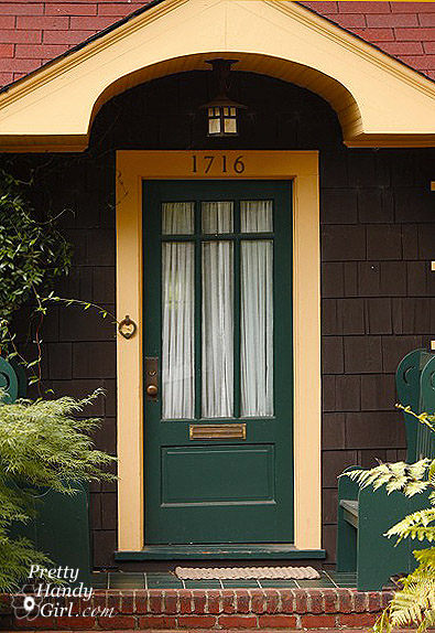
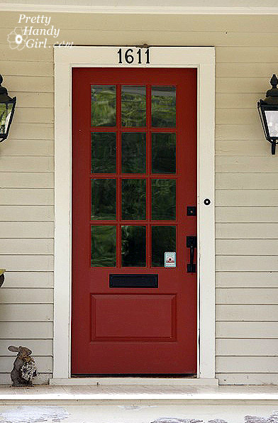
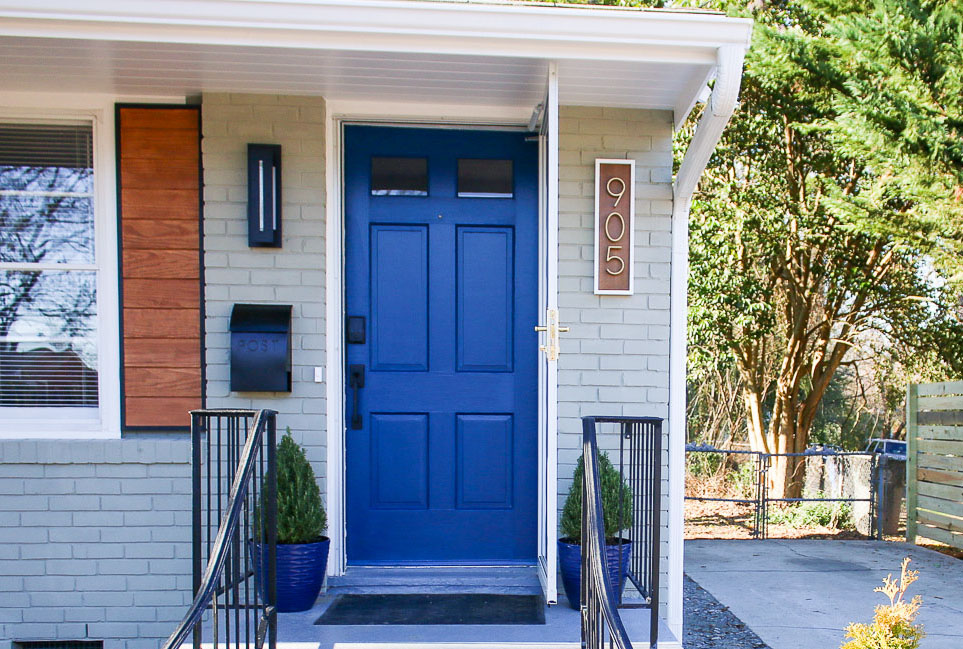
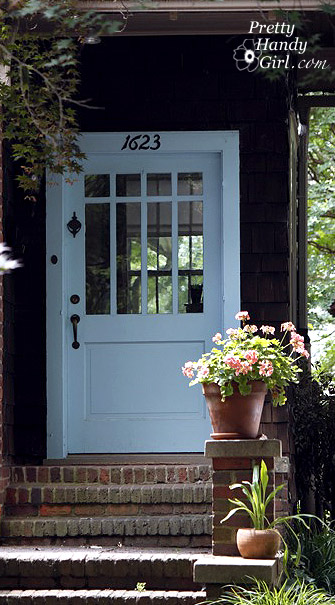
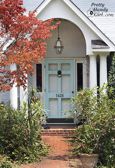
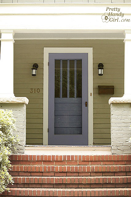
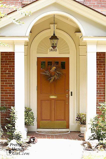
Now let’s get to these gorgeous painted front doors. Whether you are looking to add personality to a neutral exterior, or you want to create a bold focal point to elevate your home’s design, we have a ton of color inspiration for you! The paint color is noted in the link below each picture to make it easier for you to identify the name and brand of the paint color.
You will see a variety of brands including Sherwin Williams, Benjamin Moore, Valspar, Magnolia Paint and more.
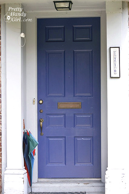
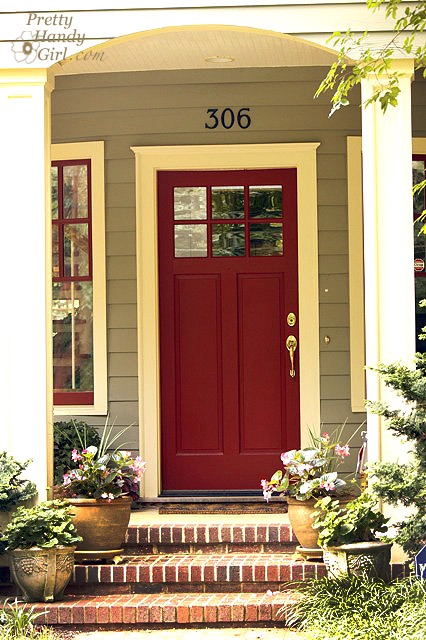
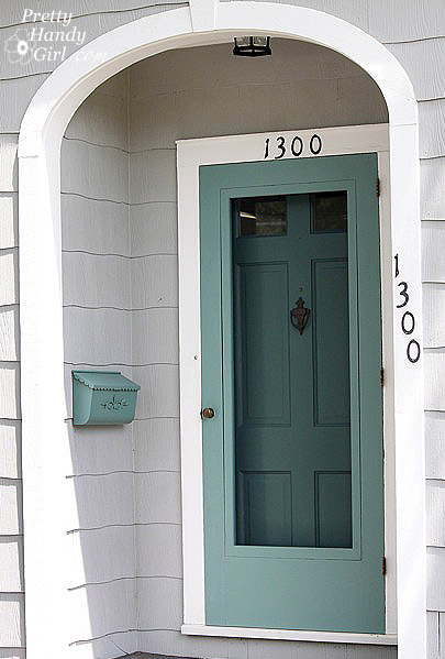
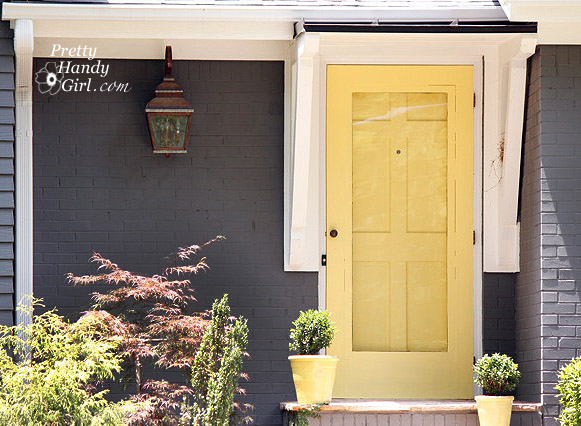
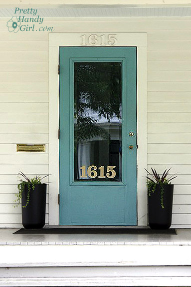
Front Door Colors

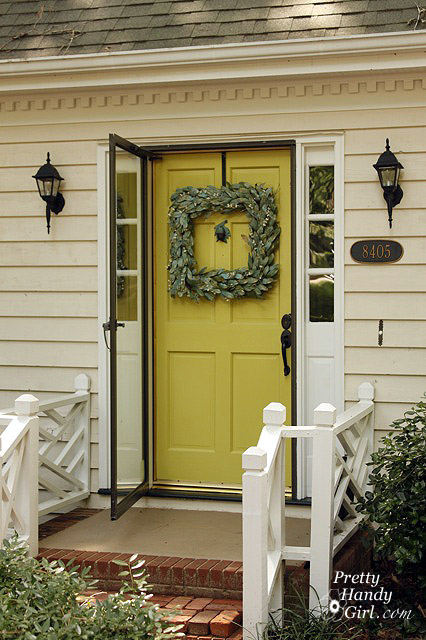
Siding color: Locally Sown by Magnolia Paint Siding


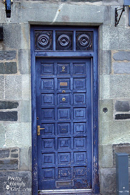
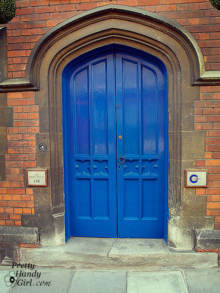
Pictures of Front Door Paint Colors (International)
And just in case you have a lust for the international palette, these are a few doors I spotted overseas.
Iceland has loads of colorful doors because they typically use metal and stucco on their homes. The colorful doors add punch to an otherwise bland house color scheme.


Once you travel to France, Spain, and England you find yourself surrounded by stone homes. They also love to paint doors in vibrant colors.


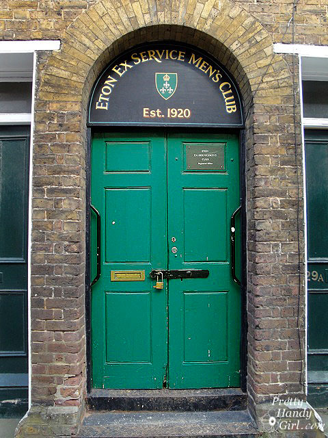


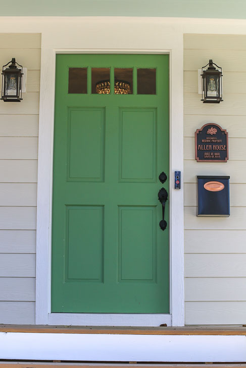
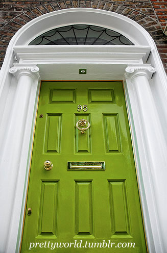
Talk about WOW factor! I found this green door online HERE.

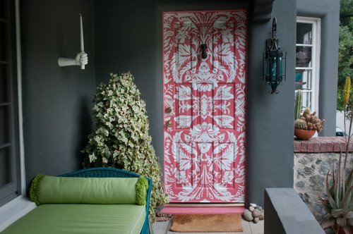
And if that isn’t enough to catch your attention, look what Allison Cosmos did to this door:
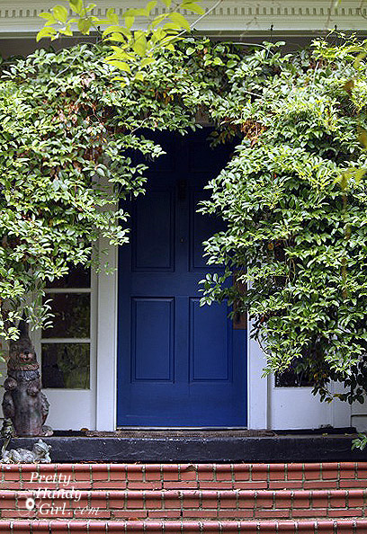
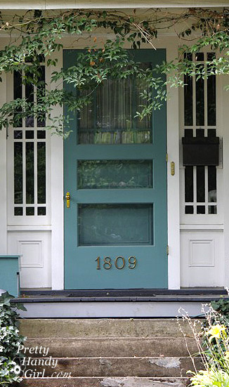
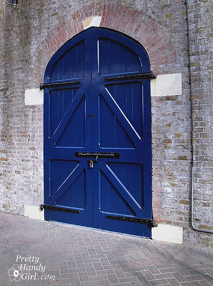
My all time favorite front door photo is this one from The Impatient Gardener. Could you tell that I’m drawn to blues?

Back at the Pretty Handy Girl abode, my home’s doors were purple for over 7 years.
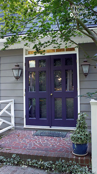
Purple Honor by Duron Paint (ask a Sherwin Williams store to mix this color)
After that, I decided to add some vibrancy and paint the front doors an amazing green.


Perennial Green by Benjamin Moore
Before I painted them, I had to strip many layers of paint off them. If you ever need to strip paint off your front door, I have some tips and a tutorial for you.

But, I’m notorious for wanting to change things in and around my house. A few years ago, we needed to replace siding and I decided to paint the whole house a new color palette.

Lei Flower by Sherwin Williams
Siding Color: Inner Balance by Benjamin Moore
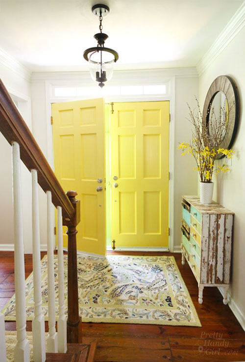
Because I love color, I also painted the inside of my front doors a cheery yellow!
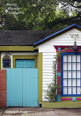
Don’t forget you can paint your out buildings and shed doors a fun color, too!

Spirit in the Sky by Sherwin Williams

Share this post because friends don’t let friends have boring front doors.
Pin this graphic to share these bright front door colors with your friends! I hope you found the perfect color choice for your front door!

I hope you have been inspired! Now Go Bold or Go Home!
After you’ve learned how to choose the perfect color, you’ll want to learn how to paint your doors like a professional.

Speaking of painting, I have painted almost every room in our home now. Make that almost every room in two homes!
You could say that over the years I’ve learned a few tricks of the trade.
If you’re planning to paint, I recommend these favorite painting tools that I pull out for every painting job.

If you like this post, you’ll want to find out the 15 Simple Ways to Improve Your Home’s Curb Appeal!


